
Line Graph
When I want to visualize some metric over time (sometimes even across different cohorts
import numpy as np
import pandas as pd
import os
from IPython.display import display, Image
import plotly.graph_objs as go
control = pd.read_csv('../data/line-graph-1.csv')
treatment = pd.read_csv('../data/line-graph-2.csv')
engagement = pd.read_csv('../data/line-graph-3.csv')
cohorts = pd.read_csv('../data/line-graph-4.csv')
fig = go.Figure()
fig.add_trace(
go.Scatter(
x=engagement['timestamp_day'],
y=engagement['daily_engagement'],
mode='lines',
name=''
)
)
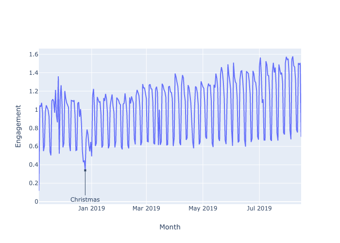
fig.update_layout(title='',
xaxis_title='Month',
yaxis_title='Engagement',
annotations=[
go.layout.Annotation(
x='2018-12-25',
y=0.34,
xref="x",
yref="y",
text="Christmas",
showarrow=True,
arrowhead=7,
ax=0,
ay=60
),
]
)
fig.show()
Image(filename='../images/line-figure-1.png')
# Plot the mean time per day per variant (control/treatment)
fig = go.Figure()

# Control
fig.add_trace(
    go.Scatter(
        x=control['dt'],
        y=control['mean_total_active_mins'],
        mode='lines',
        name='control',
    )
)

# Treatment
fig.add_trace(
    go.Scatter(
        x=treatment['dt'],
        y=treatment['mean_total_active_mins'],
        mode='lines',
        name='treatment')
)

# Plot labels
fig.update_layout(title='',
                  xaxis_title='Date',
                  yaxis_title='Minutes',
                  annotations=[

                  ],
                 shapes=[
                     go.layout.Shape(
                        type="line",
                        x0='2019-02-05',
                        y0=0,
                        x1='2019-02-05',
                        y1=35,
                        line=dict(
                            color="MediumPurple",
                            width=4,
                            dash="dot",
                            ))])

fig.update_yaxes(range=[10, 33])

fig.show()
Image(filename='../images/line-figure-2.png')
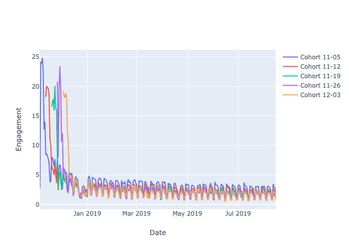
initial_cohorts = [u'2018-11-05 00:00:00',
                   u'2018-11-12 00:00:00',
                   u'2018-11-19 00:00:00',
                   u'2018-11-26 00:00:00',
                   u'2018-12-03 00:00:00']

fig = go.Figure()
for cohort in initial_cohorts:
    temp_category = cohorts[cohorts['shop_cohort'] == cohort]
    fig.add_trace(
        go.Scatter(
            x=temp_category['timestamp_day'],
            y=temp_category['daily_engagement'],
            mode='lines',
            name='Cohort {}'.format(cohort[5:10])))

fig.update_layout(title='',
                  xaxis_title='Date',
                  yaxis_title='Engagement',
                  annotations=[
                  ])

fig.write_image('line-figure-3.png')


fig.show()
Image(filename='../images/line-figure-3.png')
# TODO: Add reusable code for adding error bars to lines