Shifted-beta-geometric
Implementation of sBG for modeling discrete-time, contractional behaviour. Excel proved to be too difficult for my computer to handle.
import numpy as np
import pandas as pd
import os
from IPython.display import display, Image
from scipy.optimize import minimize
import plotly.graph_objs as go
def compute_probabilities(alpha, beta, num_periods):
    '''Compute the probability of a random person churning for each time period'''
    p = [alpha / (alpha + beta)]
    for t in range(2, num_periods + 1):
        p.append((beta+t-2) / (alpha+beta+t-1) * p[t-2])
    return p


def pct_dying(data, num_periods):
    '''Compute the number of people who churn for each time period'''
    n = [1 - data[0]]
    for t in range(1, num_periods):
        n.append(data[t - 1] - data[t])
    return n


def log_likelihood(alpha, beta, data):
    '''Objective function that we need to maximize to get best alpha and beta parameters
    **Computed log-likelihood will be 1/n smaller than the actual log-likelihood (n = original sample size)**
    '''
    if alpha <= 0 or beta <= 0:
        return -99999
    probabilities = np.array(compute_probabilities(alpha, beta, len(data)))
    percent_dying = np.array(pct_dying(data, len(data)))

    return np.sum(np.log(probabilities) * percent_dying) + data[-1] * np.log(1 - np.sum(probabilities))


def maximize(data):
    '''Maximize log-likelihood by searching for best (alpha, beta) combination'''
    func = lambda x: -log_likelihood(x[0], x[1], data) # x is a tuple (alpha, beta)
    x0 = np.array([100., 100.])
    res = minimize(func, x0, method='Nelder-Mead', options={'xtol': 1e-8, 'disp': False})

    return res.x


def forecast(data, num_periods):
    '''Forecast num_periods from the data using the sBG model'''
    alpha, beta = maximize(data)
    probabilities = compute_probabilities(alpha, beta, num_periods)

    expected_alive = [1 - probabilities[0]]
    for t in range(1, num_periods):
        expected_alive.append(1 - np.sum(probabilities[0:t+1]))

    return pd.Series(expected_alive)


def forecast_dataframe(data, num_periods):
    '''Creates dataframe with forecast with additional performance columns'''
    forecast_column = forecast(data, num_periods)
    actual_column = pd.Series(data)

    period = pd.DataFrame({'Period': np.arange(1, np.max([len(data) + 1, num_periods + 1]))})
    actual = pd.DataFrame({'Actual': actual_column})
    the_forecast = pd.DataFrame({'Forecast': forecast_column})

    df = pd.concat([period, actual, the_forecast], axis=1)

    # Compute pct error as well
    df['pct_error'] = np.abs(df['Actual'] - df['Forecast']) / df['Actual'] * 100

    return df
df = pd.read_csv('../data/sBG-1.csv')
df
# Get predictions on 12 periods using 7 periods of data for both segments
regular_series = forecast(df.loc[:7, 'Regular % Alive'].to_list(), 12)
highend_series = forecast(df.loc[:7, 'Highend % Alive'].to_list(), 12)

regular_df = pd.DataFrame({'Year': np.arange(1, 13),
                           'Expected %': regular_series
                          })


highend_df = pd.DataFrame({'Year': np.arange(1, 13),
                           'Expected %': highend_series
                          })

regular_df = (
    df
    .loc[:, ['Year', 'Regular', 'Regular % Alive']]
    .merge(regular_df, on='Year')
    .assign(
        Expected=regular_df['Expected %'] * 1000,
        pct_error=lambda x: np.abs(x['Expected'] - x['Regular']) / x['Regular'] * 100
    )
)

highend_df = (
    df
    .loc[:, ['Year', 'Highend', 'Highend % Alive']]
    .merge(highend_df, on='Year')
    .assign(
    Expected=highend_df['Expected %'] * 1000,
    pct_error=lambda x: np.abs(x['Expected'] - x['Highend']) / x['Highend'] * 100
    )
)
regular_df
highend_df
# in-sample, out-sample MAPE
np.mean(regular_df.loc[:7, 'pct_error'].to_list()), np.mean(regular_df.loc[8:, 'pct_error'].to_list())
fig = go.Figure()

fig.add_trace(
   go.Scatter(
       x=regular_df['Year'],
       y=regular_df['Regular'],
       mode='lines',
       name='Actual'
   )
)

fig.add_trace(
   go.Scatter(
       x=regular_df['Year'],
       y=regular_df['Expected'],
       mode='lines',
       name='Expected'
   )
)


fig.update_layout(title='7-Period Calibration for Regular Cohort',
                  xaxis_title='Year',
                  yaxis_title='Customers Remaining',
                  shapes=[
                      go.layout.Shape(
                        type="line",
                        x0='7',
                        y0=0,
                        x1='7',
                        y1=681,
                        line=dict(
                            color="MediumPurple",
                            width=4,
                            dash="dot",
                            ))
                  ]
                 )
fig.show()
Image(filename='../images/sBG-figure-1.png')
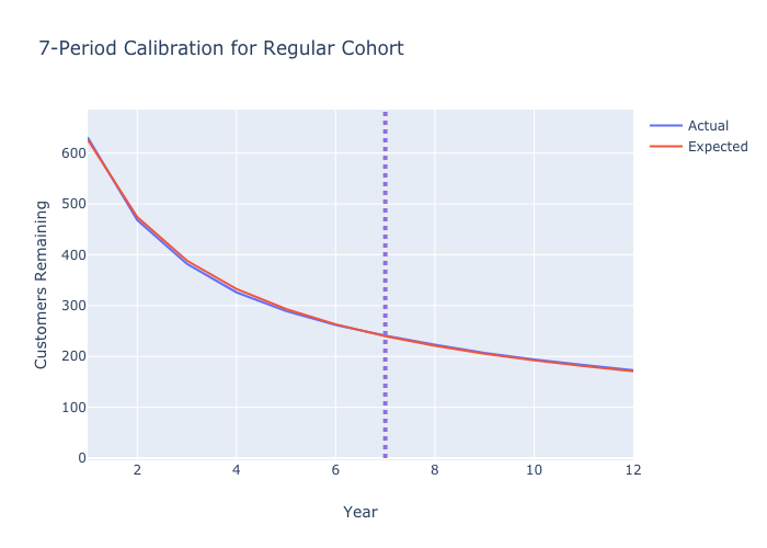
fig = go.Figure()
fig.add_trace(
go.Scatter(
x=highend_df['Year'],
y=highend_df['Highend'],
mode='lines',
name='Actual'
)
)
fig.add_trace(
go.Scatter(
x=highend_df['Year'],
y=highend_df['Expected'],
mode='lines',
name='Expected'
)
)
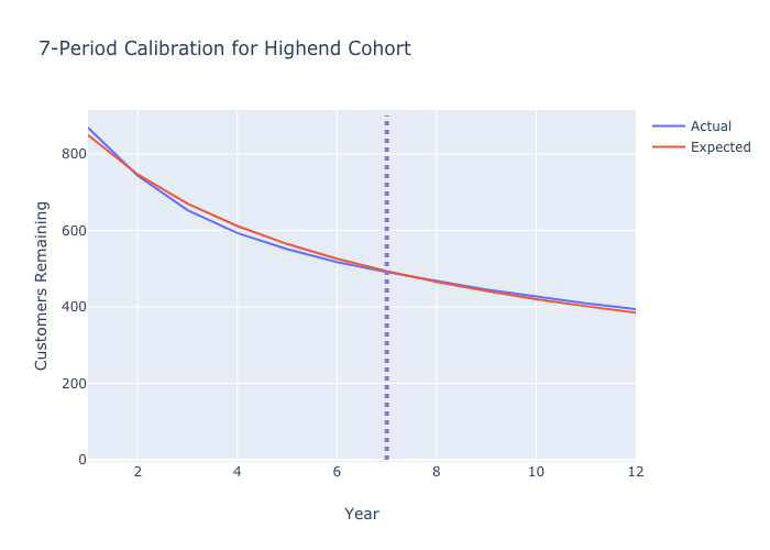
fig.update_layout(title='7-Period Calibration for Highend Cohort',
xaxis_title='Year',
yaxis_title='Customers Remaining',
shapes=[
go.layout.Shape(
type="line",
x0='7',
y0=0,
x1='7',
y1=900,
line=dict(
color="MediumPurple",
width=4,
dash="dot",
))
]
)
fig.show()
Image(filename='../images/sBG-figure-2.png')